
UX Research, Product Design, Icon design
Design lead on Maps Squad
iOS, Android, Web app
Komoot is Europe’s most popular outdoor navigation app, with over 45M registered users, 10M monthly active users during peak summer, and revenue of around €40M in 2024. I joined Komoot in June 2024 as Product Designer on the newly formed Maps Squad.
I was hired to design a new route-planning experience within a cross-functional team. Additional responsibilities included improving aspects of our Design System contribution process so that the wider design and development teams could move faster.
Defined planner interaction patterns to support 100K+ monthly users
Provided a scalable redesign ready for phased delivery
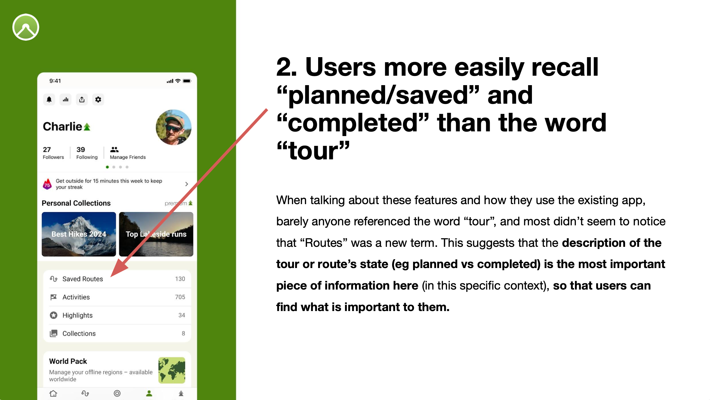
Redesigned the profile screen to streamline access to saved routes and activities
Komoot had prioritised growth and community features for the past few years, which meant the route-planner hadn’t kept pace. This led to feature disparity between platforms and significant tech and design debt. As the planner foundations were outdated, we chose to rebuild it from scratch before entering new markets.
Some indicators that helped this decision:
1.Qualitative feedback
Users often reported that the route-planning experience on mobile was too complicated. This was hard to improve without architectural upgrades.
2. Feature disparity
Features were usually demoed in public events or in the press on web (as it was feature complete), despite mobile having much higher usage. This caused confusion and frustration when native apps lacked those standout features.
3. Tech debt
Planner-specific features took around 3x longer to deliver on native platforms than web. Some features (like 3D maps) couldn’t be built at all with the old architecture. These delays blocked strategic progress in a highly competitive market.
“Anyone can create and save a route in under a minute.”
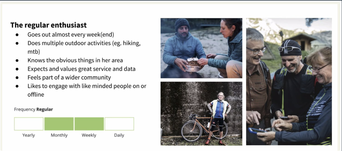
This was our guiding design principle. Our user base ranged from casual hikers to ultra-distance cyclists, all relying on our tools for safe navigation. So this principle served as a useful shorthand to keep us focused on the middle ground.
Some of the supporting metrics that cascaded from this included:
Redesigning and improving on the route planner was a large project with many moving parts. Working in an Agile team we naturally wanted to avoid a big-bang approach and preferred to iterate. The development team’s velocity was even lower than we expected due to the tech debt they faced. So myself and the product manager took the decision to break the project down further and spend more time in discovery and conceptual work. I defined a discovery & design process as follows for each feature:
How are others doing it? What are they getting right or wrong? This might cover mobility apps like Google & Apple Maps, navigation apps like Waze, through to outdoor specific competitors like Gaia GPS, AllTrails, outdoorative, Strava etc.
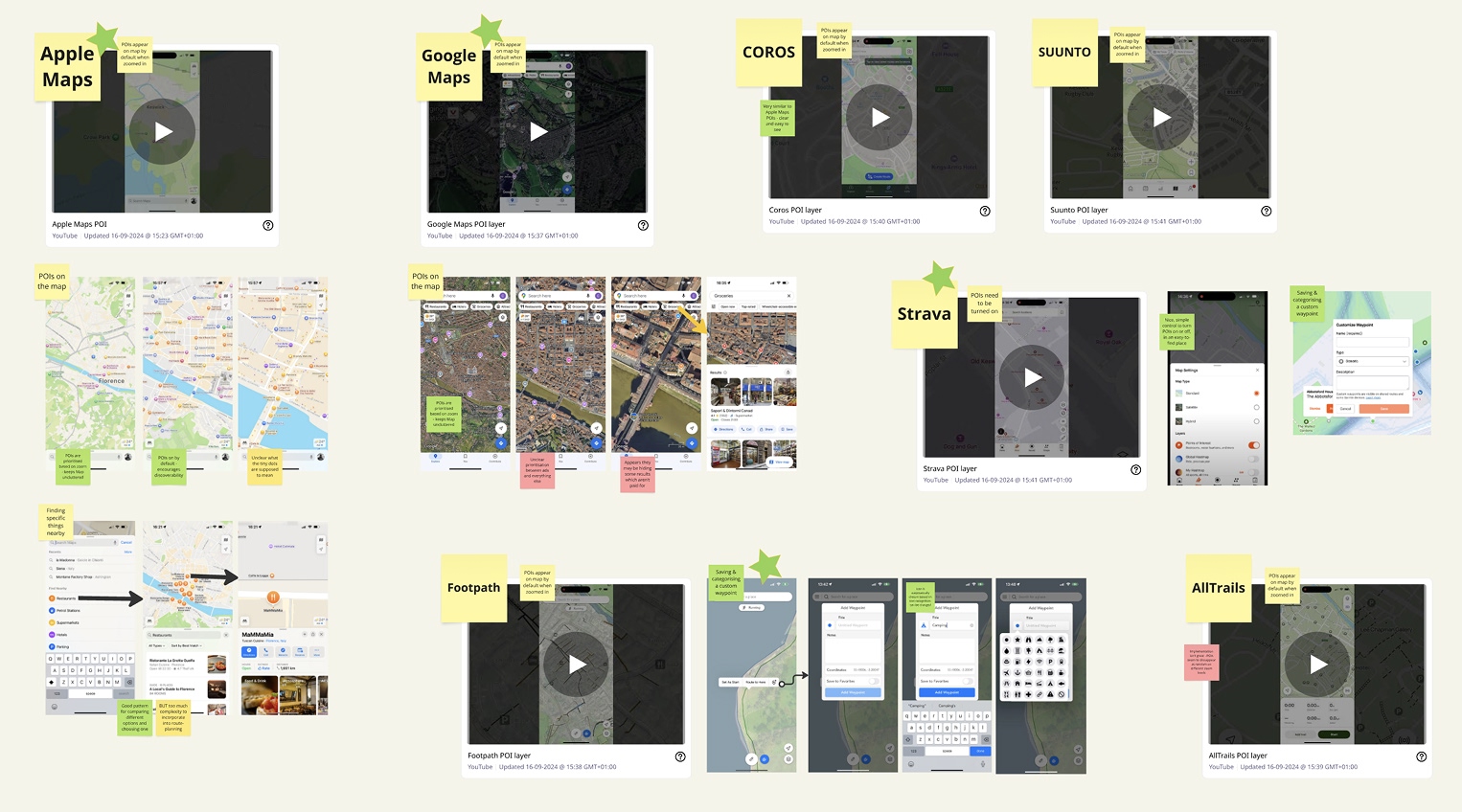
I analysed existing qualitative feedback from available sources (data analysis was unavailable for most of these features) and conducted my own primary research with users if necessary.
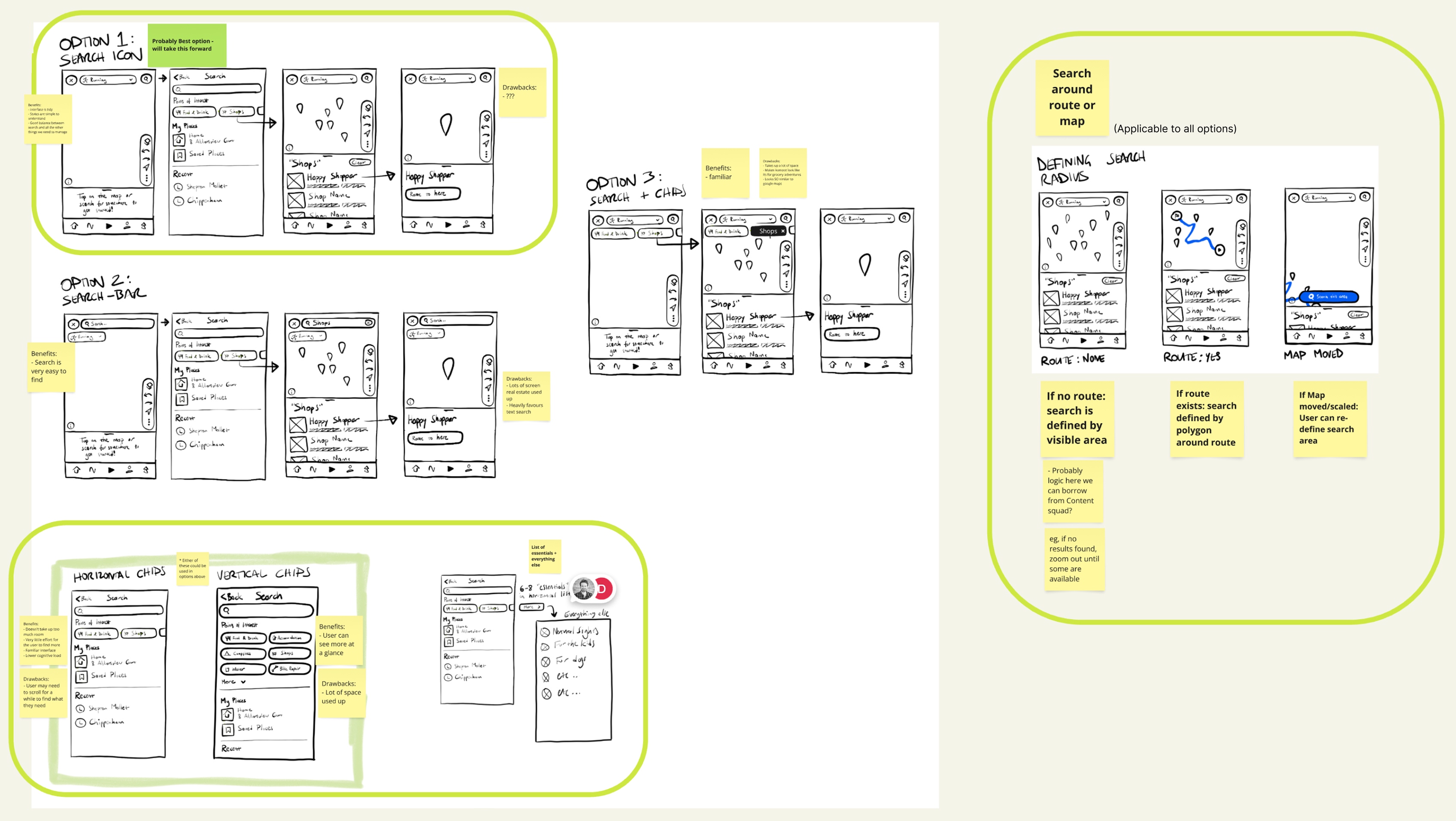
I worked out different options for how we could improve each feature, ranging from "if it ain't broken..." to "clear wins", using steps 1 & 2 to determine which recommendation made sense for each feature. These were produced at just-enough fidelity to illustrate the key aspects, usually as wireframe sketches. I then collaborated with the product manager and content designer to align on direction.

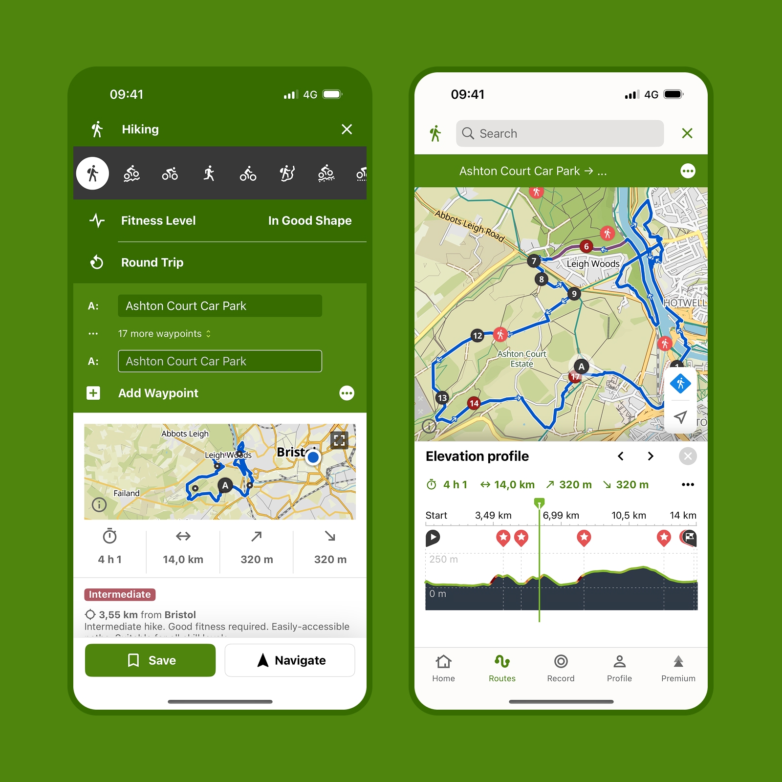
When a feature was close to being delivered by the engineering team, I would work on high-fidelity designs and specifications for them. Map interfaces can't be adequately prototyped in Figma, so used Protopie to build experiences that felt closer to the real thing. Detailed specification was created in Figma and I worked closely with my engineering and QA colleagues during delivery.
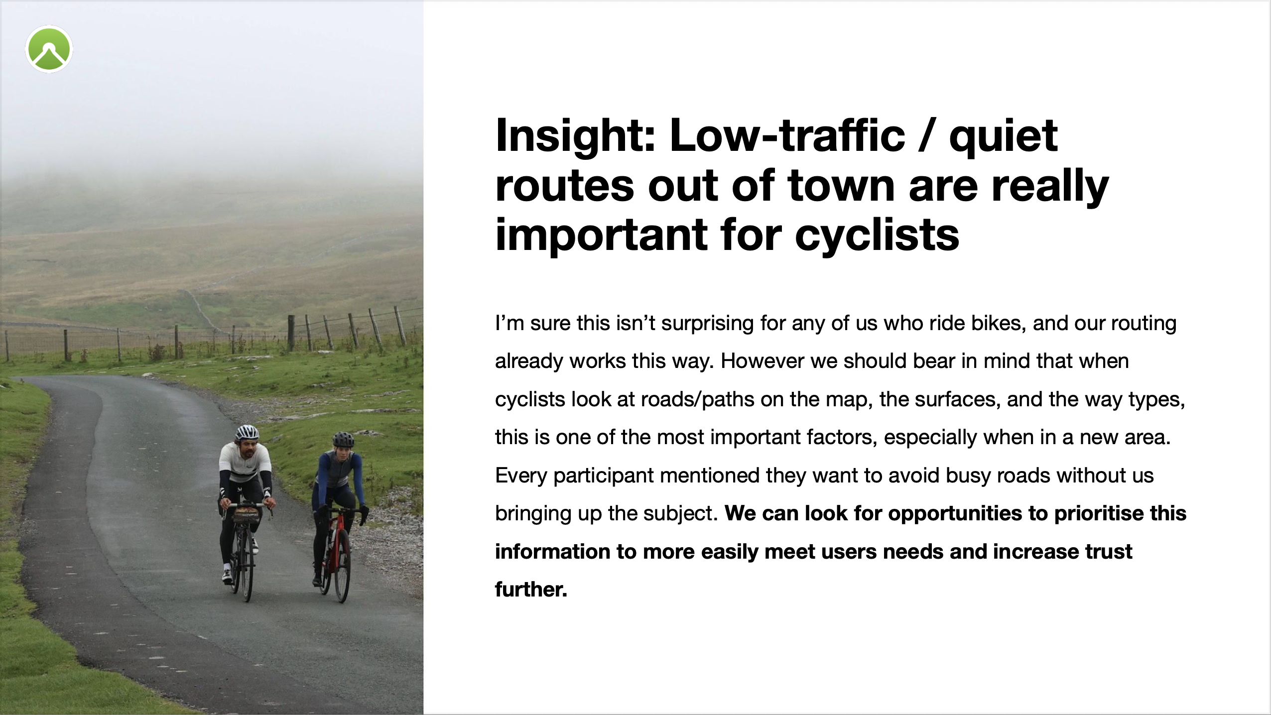
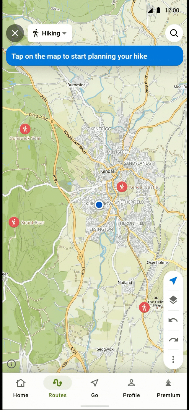
Users frequently reported that route-planning was complex when adding waypoints. On most planners, users manually plot points and the planner draws a line between them. Komoot’s “secret sauce” is that it finds the _best_ way between points based on sport type (hiking, running, cycling). This might mean avoiding busy roads for cyclists or favouring popular trails for hikers, using anonymised data from other users’ activities.
Mostly this works well, but issues arise with more complex routes. For example: Harry wants to make a bike route for him and his friends that starts at home, loops around a lake, and stops for pizza on the way back. Because the pizza place is close to home, the router often inserted it before the lake (as that’s quicker, quieter, etc). But Harry’s ideal day isn’t “get me between these places the best way”, it’s “let’s go the lake and stop for pizza later”. In different contexts, either is correct - but the router can’t know which without extra input.
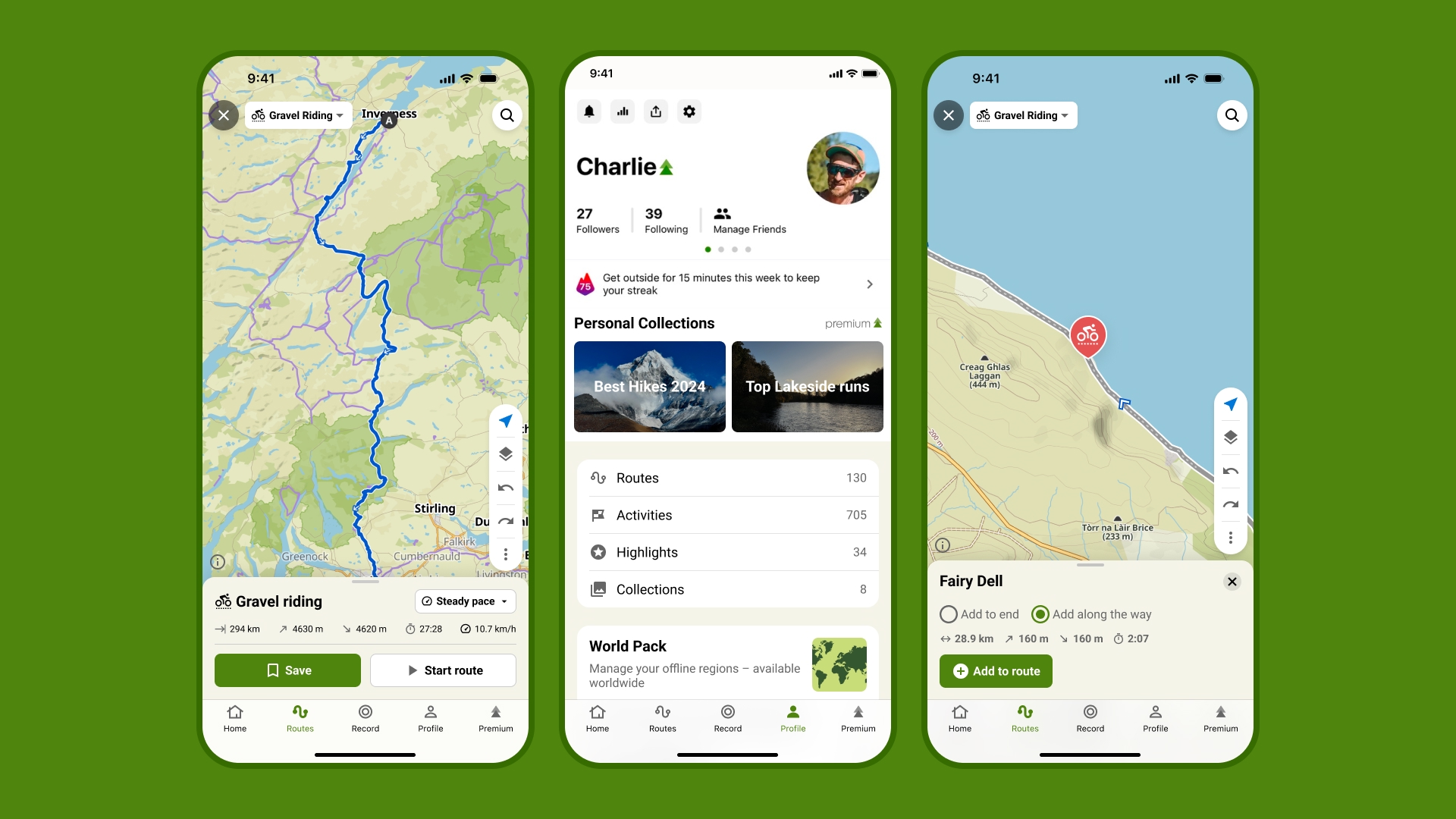
I decided to require users to choose between adding a point to the end of the route or along the existing route. They’d see a preview of the effect on the map.
This deliberately adds a bit of friction. The trade-off is that when users explicitly choose where the waypoint goes, the result is far more predictable. While the micro-interaction may take longer, the overall experience is less error-prone and should lead to higher satisfaction. This pattern existed on Android, where route completion rates were higher than iOS (which didn’t ask users to choose).
We set up a beta community of 100 users to to test with prior to public release. Through qualitative and quantitative studies we would gather feedback from them and iterate before launch of the new planner. Komoot was acquired before this phase of the project began. Business priorities changed and unfortunately the planner redesign was cancelled.
The prototype shown above was being tested with users just prior to acquisition and signals were positive.